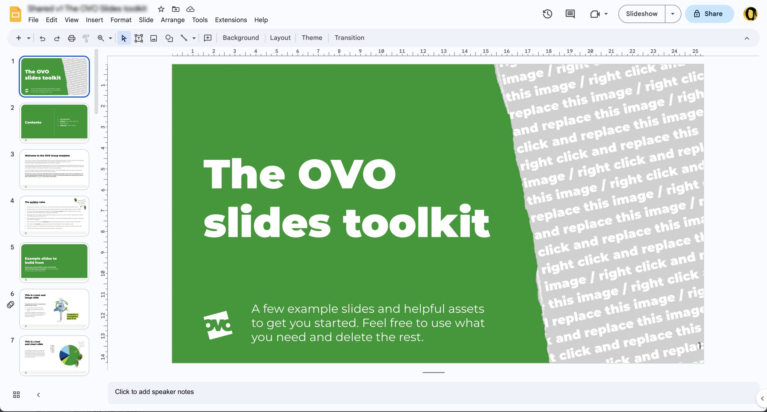
OVO came to us to help them realise a toolkit that they had devised for their marketing and comms team to help people with the new brand refresh. This included a range of predefined slides that they could edit or adapt, as well as slides that supplied standard charts, shapes, icons and other useful devices that would reduce the time it took to create presentations.
The brand shapes, which were used to add visual interest to the slides, were vector-based to allow them to recolour them, using a predefined brand colour palette, for any specific use on a slide.
The design used Montserrat, from the Google Fonts library, throughout. The design utilised Normal and Black weights, to emphasise the heading against the otherwise open and readable text.


