Operandi work on a wide range of branding projects for designers and agencies across the UK and Europe. We specialise in developing brand templates in Microsoft Office, Google Docs, Keynote and Pages. Implementing a brand in this way includes a thorough understanding of any cross-platform font problem, and how it affects rolling out the new brand project. Faux font problems are one of those issues you should be aware of.
Fonts bring a central style and feel to any design or document. A designer can spend a lot of time choosing the right font pairing or single font family to correctly fit the brand use. Computer users are used to seeing a long list of pre-installed fonts, but most brand projects or templates are set up to use one or two specific fonts for their business. A number of the standard computer fonts lack individual styles beyond very useable serif or san serif forms, and it’s not uncommon for the designers to rely on the rather bland Arial or Calibri in most cases, without appreciating the full list of available fonts, especially when working with Word or PowerPoint.
When a branding project introduces a custom font, designers should be more aware of the differences of using such fonts interchangeably on Mac and Windows or, more importantly, the font weight selection process in the application itself. Not all fonts are set to be used cross-platform, and there is an additional difference if choosing TrueType or OpenType formats.
Font linking issues
Windows applications list and select fonts differently to Macs. Most designers use Mac computers, which display each individual font style in a very accessible list that they can select from. The Mac includes all of the installed font weights in the list. If a weight is not installed, it will not appear in the list.

Windows, on the other hand, only displays the key font weight with access to the others by clicking the Bold or Italic button to apply that extended weight. In this case, the user has no indication if the font weight they ask for is actually available. If the designer has recommended only a subset of the font family, the user may have a cross-platform font problem, or worse, faux font problems.

Faux font issues
If a font weight is not installed, and you attempt to specify that font weight, the application will create a sudo font using a mathematical solution, not an actual font. This is generally referred to as font fauxing. Many applications, including Microsoft Word, will generate a fake or faux italic by skewing the roman font to fill the gap. In most cases this is easy to spot.
We often see projects where the designer has only specified one or two font weights from a font family. It is easy to see the problem this will cause when the brand project is implemented on this basis. We would always recommend that the client purchase the standard family, not just certain weights. [This varies from family to family, but a minimum of Roman, Italic, Bold and bold italic is recommended.]
Be aware of fake impressions
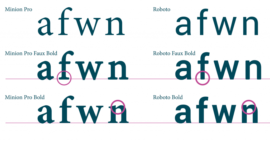
Let’s take a look at what happens when a font reverts to faux bold. In the following cases someone has specified bold where the bold weight is not installed. There are noticeable errors in the way the fonts is rendered when the actual weight is not available on the computer, although it may be difficult for a lay-man to see this, where as a designer would recognise certain differences in the fonts they know and work with regularly. Faux bold is not as recognisable as faux italic.

Extra weight can often be seen below the baseline of the text, or the shape of the individual characters are not as defined or some distortion may be seen. Faux font problems can arise where the fonts family includes more than the standard four weights. Many fonts will simply appear ‘odd’ when in a faux state.
Faux fonts with a Faux font
While working on a new brand project for one of our clients, they had specified custom Relative fonts from the Colophon foundry. This included a secondary style called Relative-Faux, which should have appeared in the font list as a separate entry, which the user could choose when needed. Unfortunately, due to font linking, all Book-style text in the Mac PowerPoint presentation appeared as Faux, if Faux was installed. If we removed Faux, the document returned to Book. On behalf of our client, we discussed this with Colophon, and the issues we were experiencing between both Mac and Windows. By removing the font-linking between Faux and Book, and setting the Faux font as a separate family, the issue was resolved.
The lesson here is not to be too afraid to take the issue back to the font supplier, who have probably seen all these issues before, and can help you with some good advice.
You might be interested in reading Safe computer fonts
